Company
OANDA
Role
Lead UX/UI Design
Team Members
- Kia Kwiecien
- Amy Zhou
- Mateusz Balawajder
- Marta Salamon
- Iuliana Strambeanu
- Umar Bacchus
Kiwi Design System - bringing consistency and efficiency to our platform and process
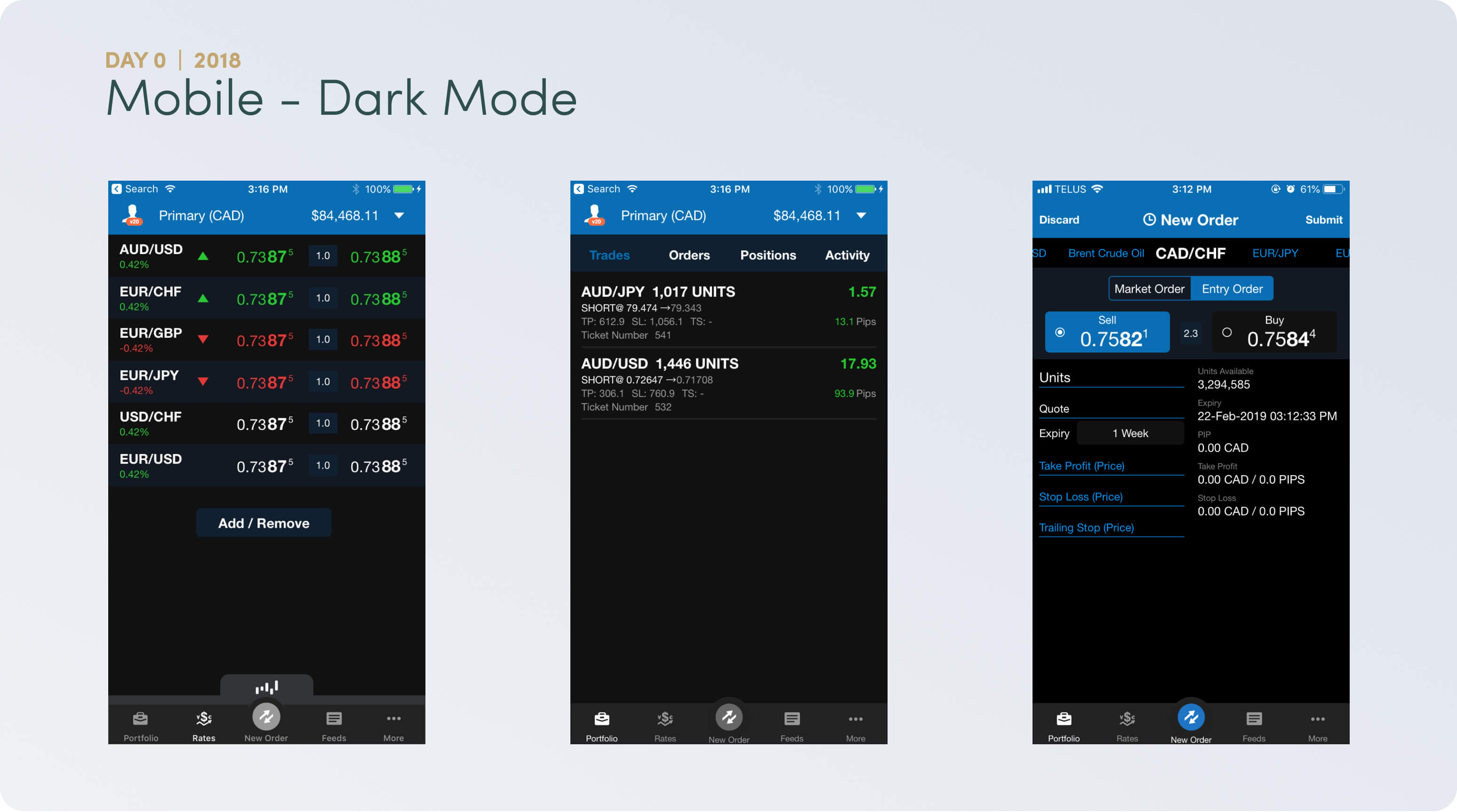
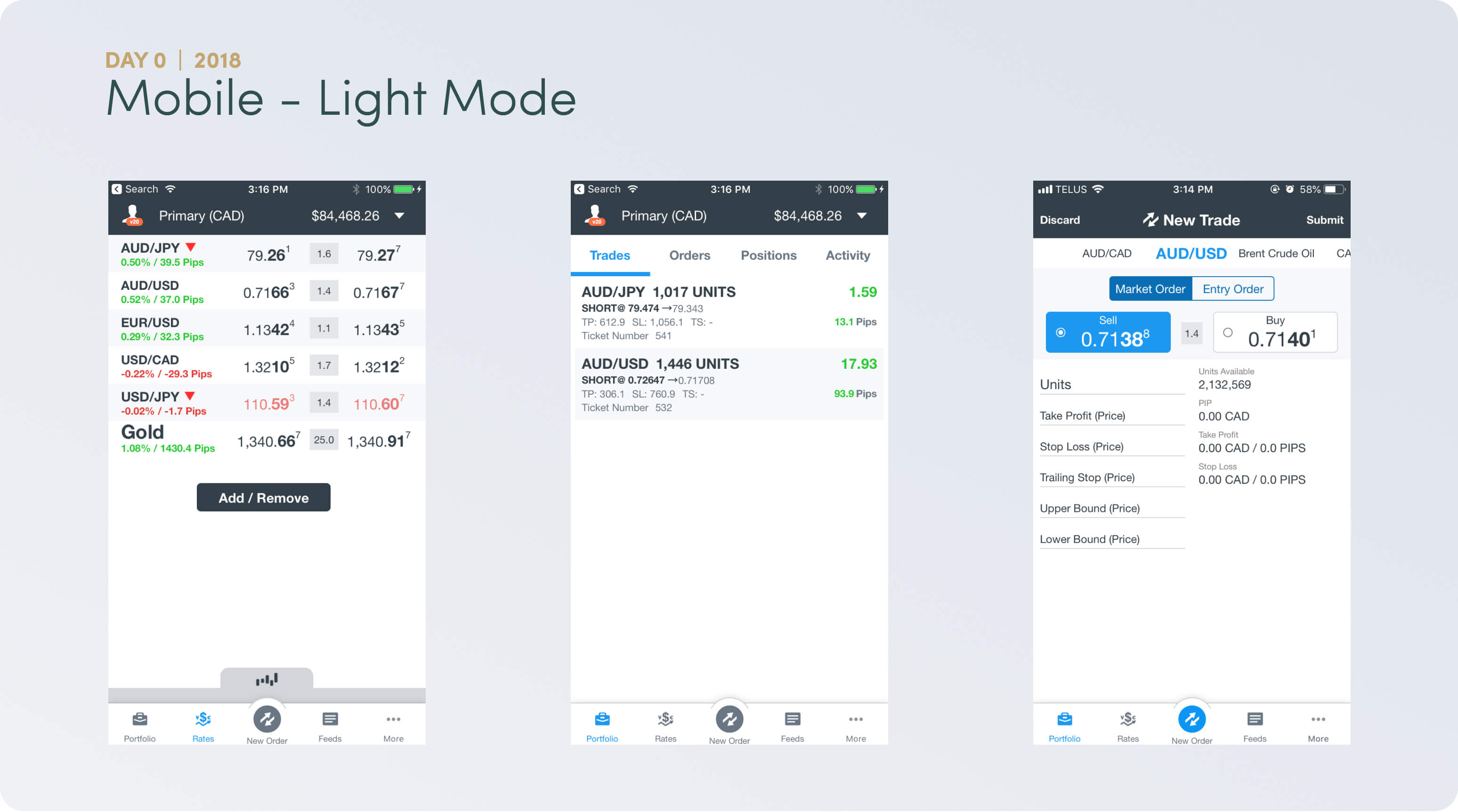
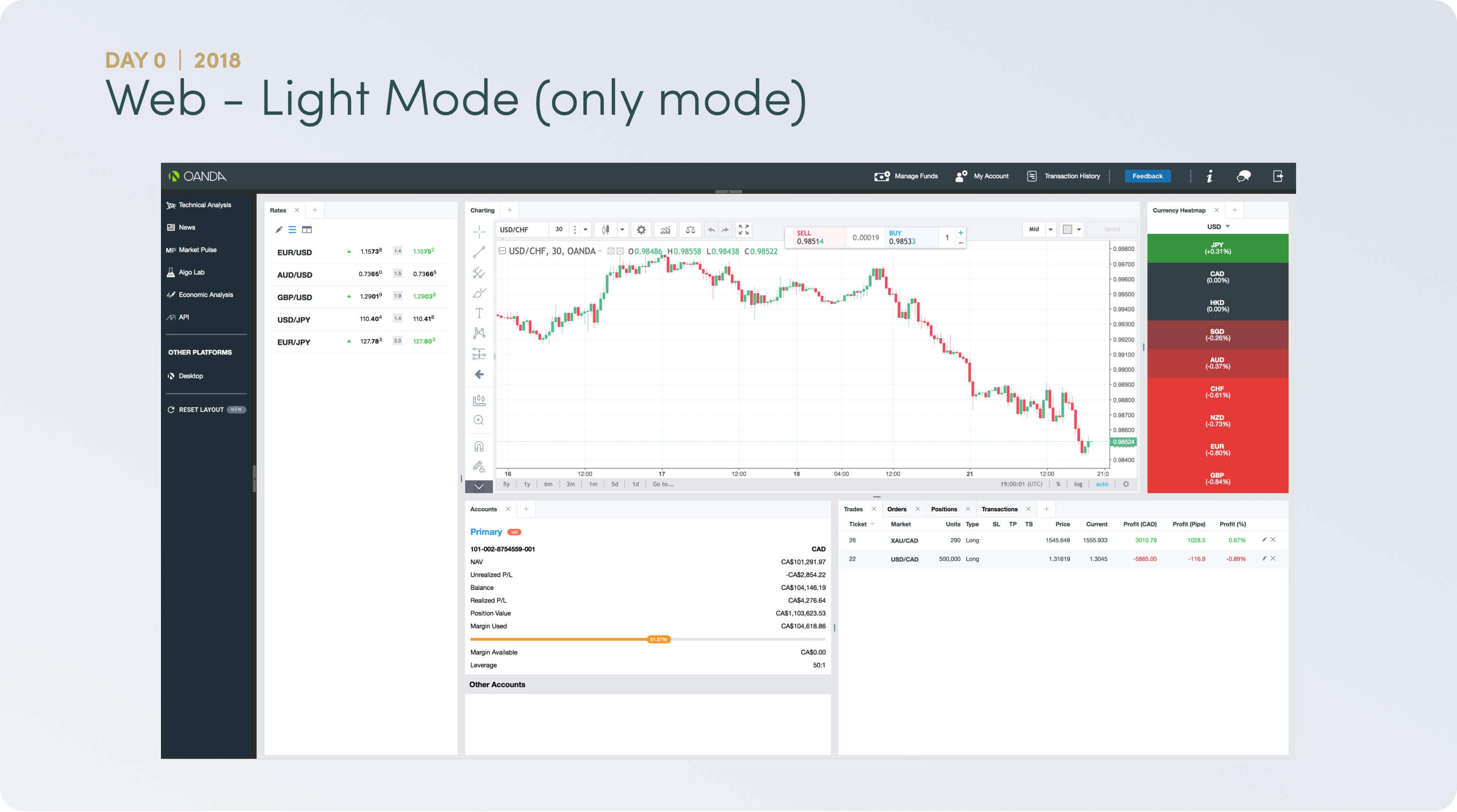
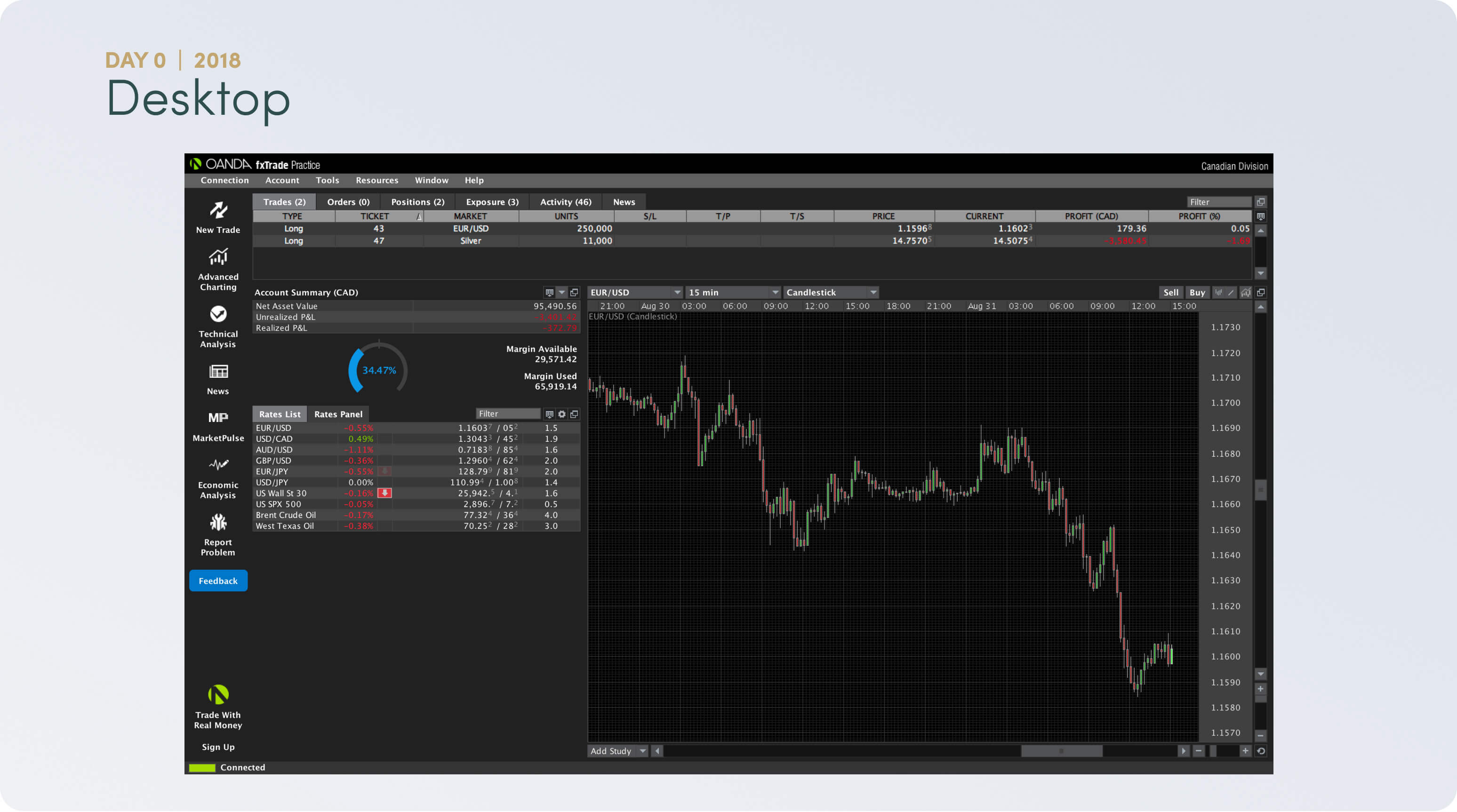
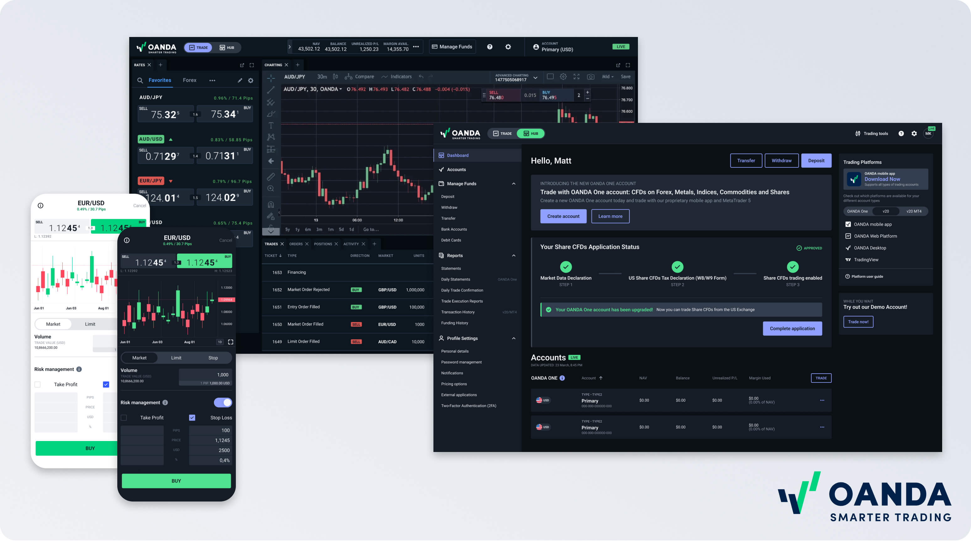
Establishing a design system for our trading platform was crucial to ensure consistency and efficiency across all platforms. With iOS, Android, Web, and Desktop versions functioning independently, inconsistency led to user frustration. By implementing this system, we aimed to streamline the user experience, strengthen brand identity, and cut down development time. The result? A unified system guarantees a seamless experience across devices, boosting user satisfaction and engagement, and underlining our dedication to design excellence and usability.

Where we started
- No cohesive design language
Major inconsistencies across all platforms - CTA'S, nomenclature, user flows, features, etc. - which led to:- user confusion
- an increase in user error
- heavy cognitive load
- customer support having multiple scripts to help users perform similar tasks depending on platform
- Not optimized for mobile
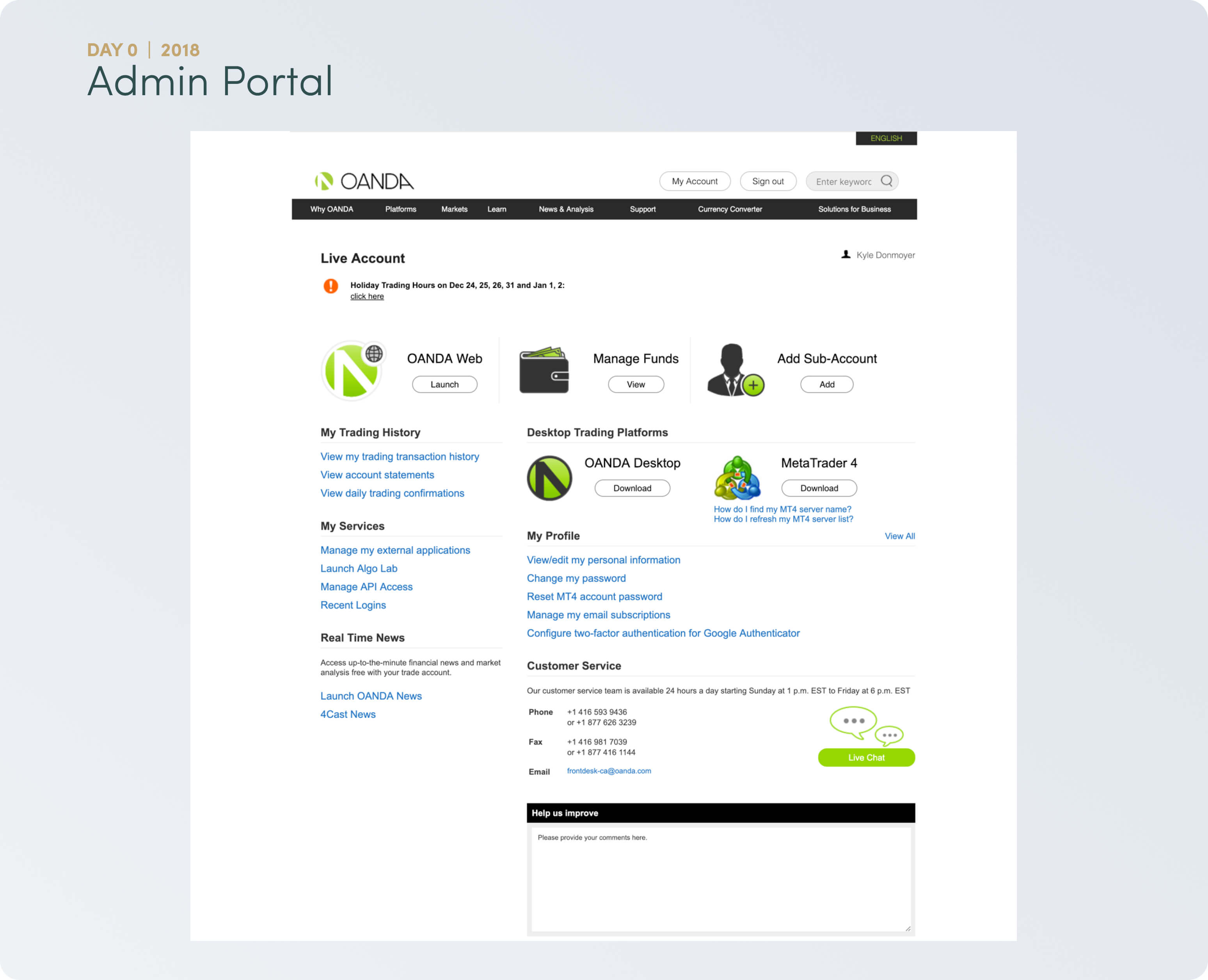
Many key screens not mobile optimized - including registration flow and account admin portal - Lengthy design handoff
Developer handoff meant providing separate designs for iOS, Android, Web and Desktop - Designing blind
User empathy and data-informed decisions not baked into the design process

Our Approach
When setting out to build our Design System, our team decided on some over-arching principles that would guide our process. These principles were informed by the 4 company values - Be Bold, Be Open, Focus and Own It:
- Empower Through Empathy
- Think Broadly; Execute Precisely
- Irreducable Simplicity

Mobile First
As time went on we saw a trend towards mobile and especially amongst new joiners. With the structure of our web and desktop platforms being very modular and component based, almost like a grid/mosaic of smaller mobile-sized screens - we set out with "Mobile First" as an over-arching guiding principle.

Design Tokens
Grid & Spacing

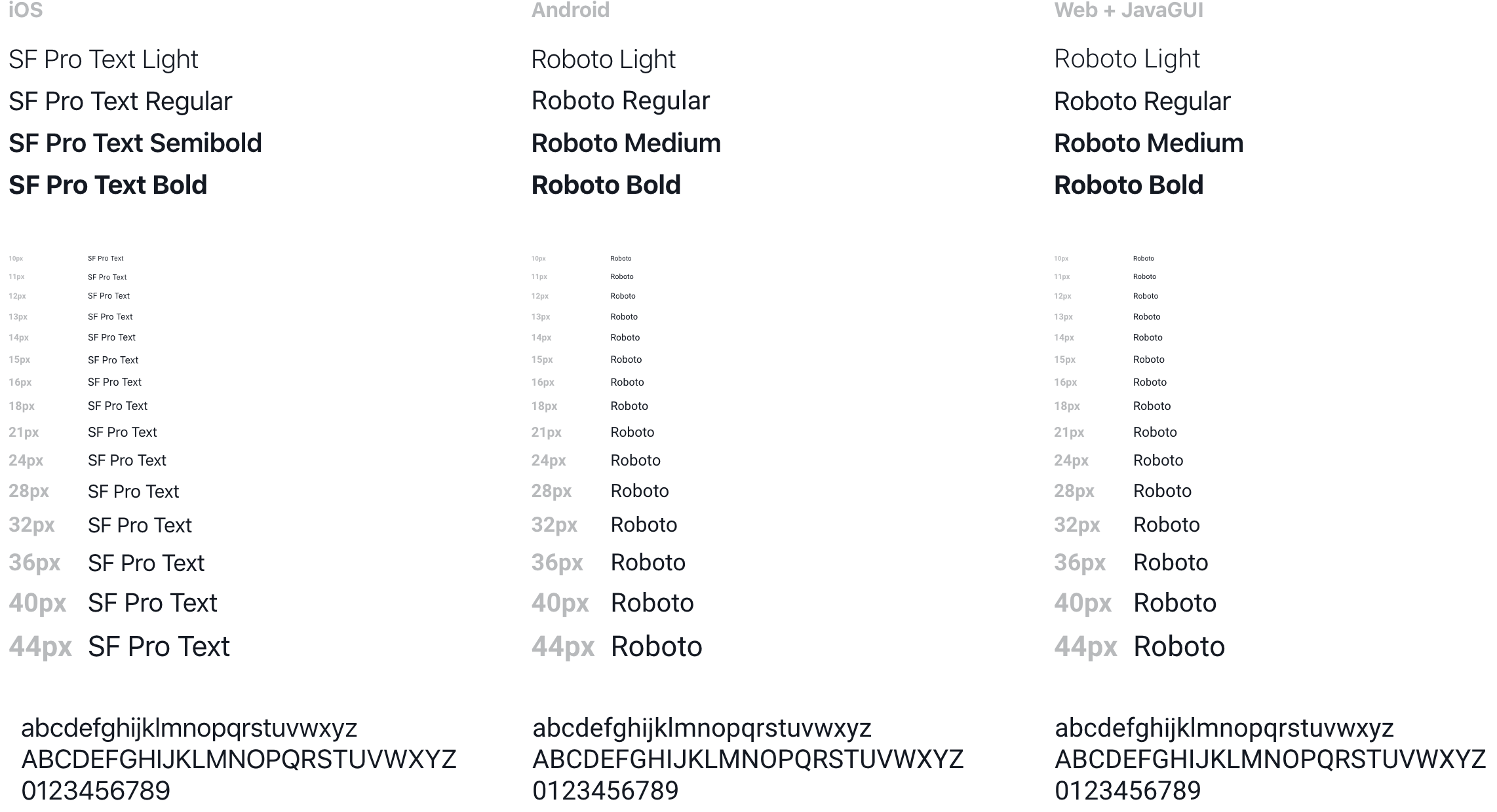
Typography
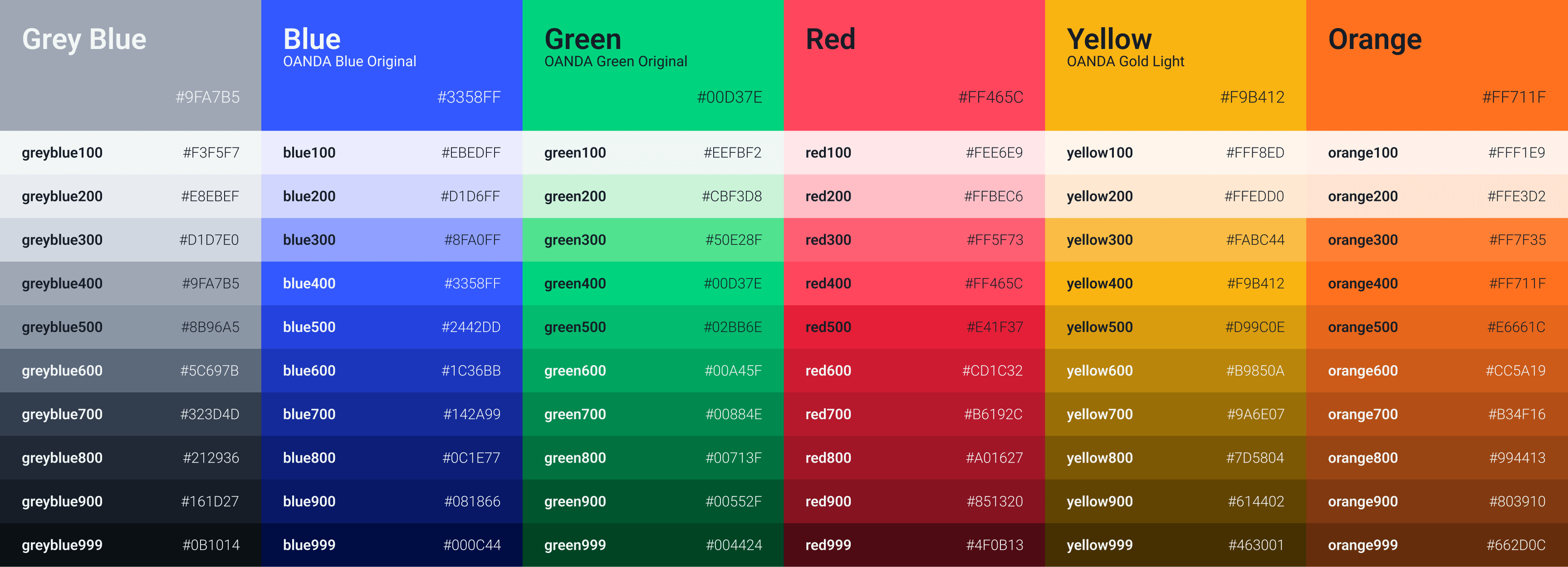
Colors

Main Screens - Trading Platform
Portfolio
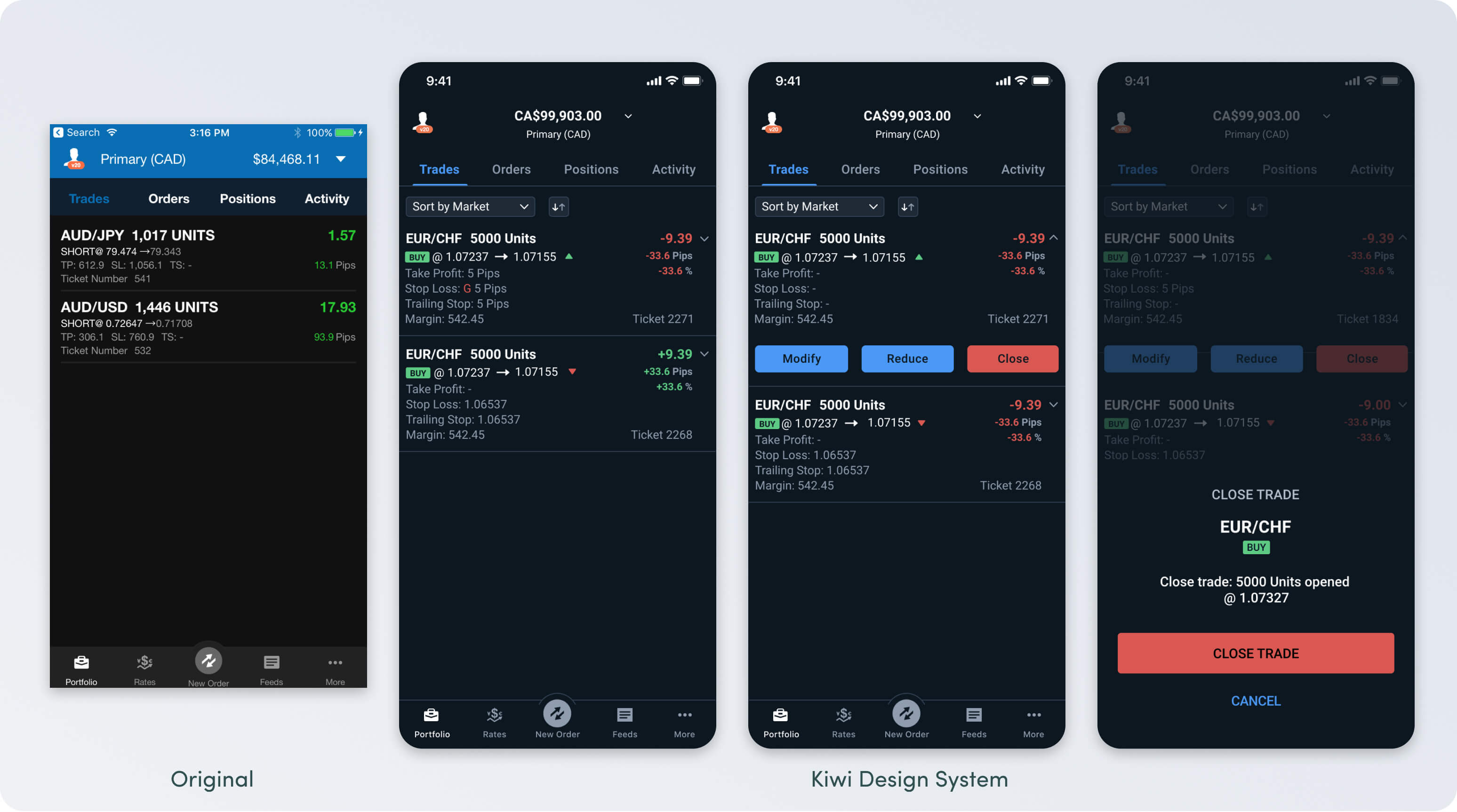
- Enhanced flexibility
Add the ability to Reduce a position - allowing users to close portions of their position - Increased discoverability
Added the ability to sort and order - Better scanability
Highlighted trade direction with badges and improved data display - Detailed information
Added full Trade Details screen to provide more information for users within the Activity section
Rates List
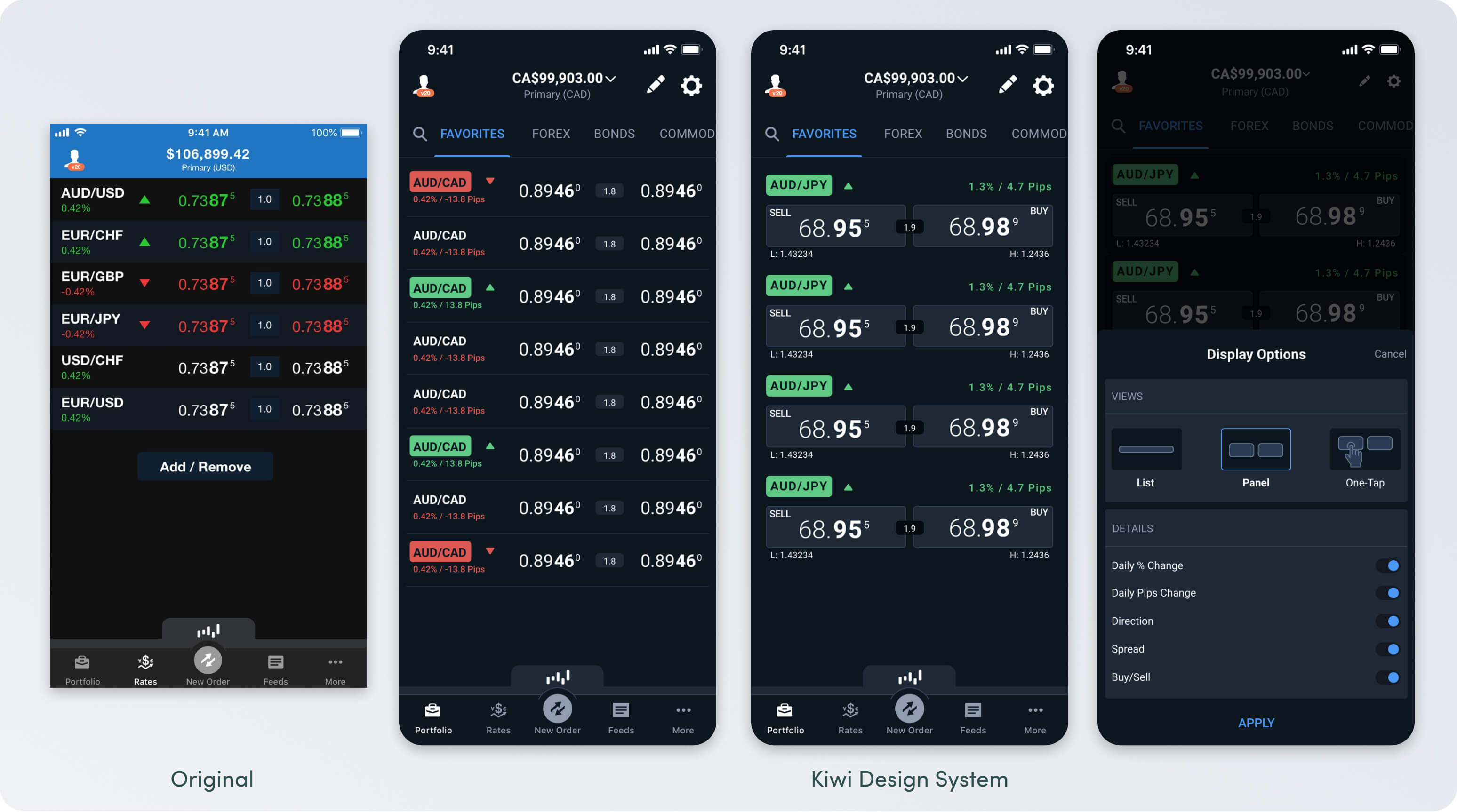
- Increased discoverability
Added search, instrument categorization and the ability to monitor all instruments without needing to add to Favorites list first - Contextual options
Provided users access to options to customize display with 1 tap.
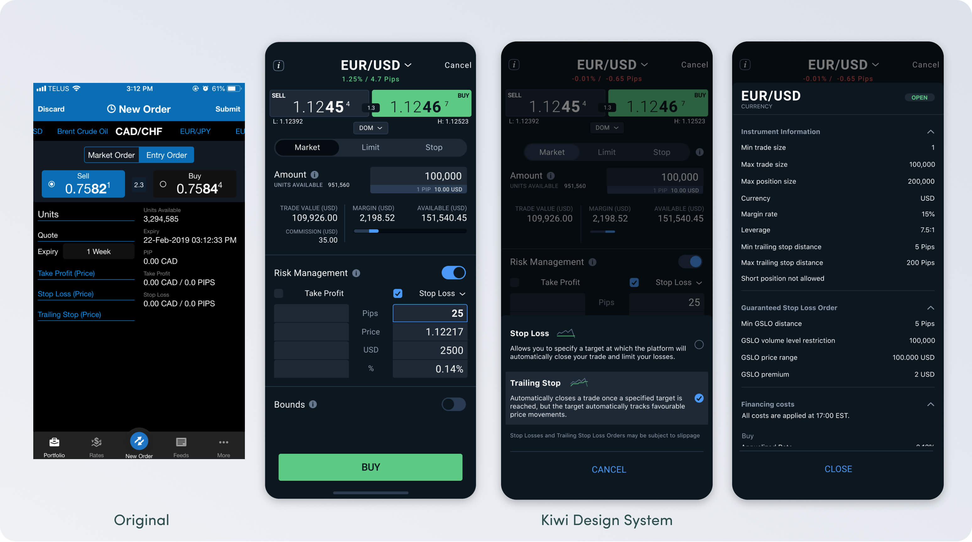
Order Ticket
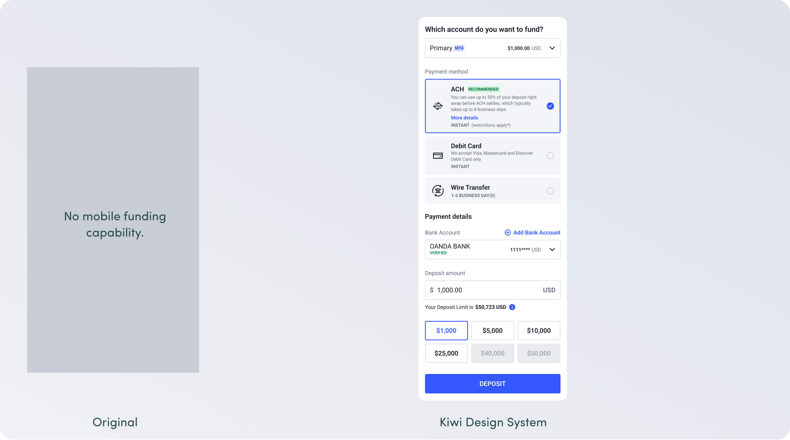
Funding
More to come
Soon - we're LEAN. Obviously this just scratches the surface of a "design system".
